
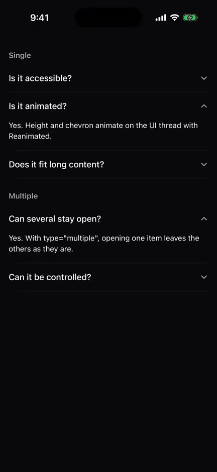
Components
7 COMPONENTS
Badge
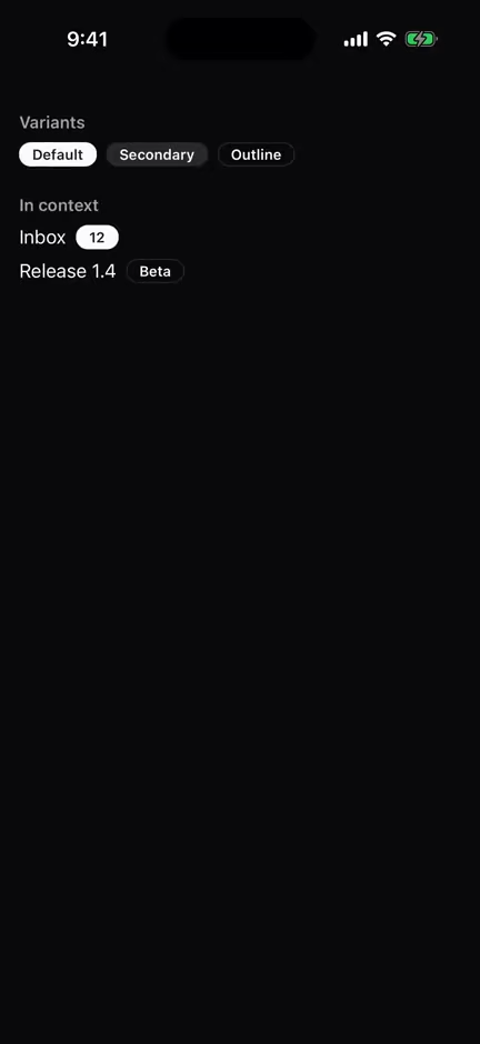
Badges
Small pill for a status, count or tag, in default, secondary and outline variants.
IN PROGRESSRepo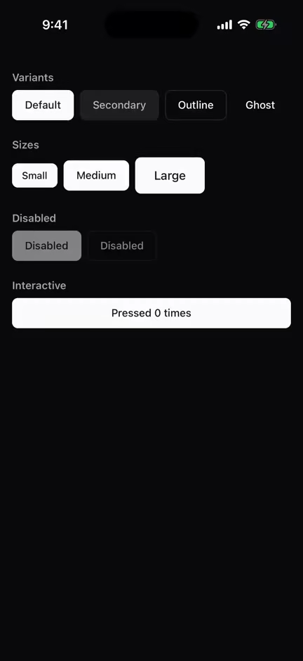
Button
Buttons
Pressable button in four variants and three sizes, with pressed and disabled states.
IN PROGRESSRepo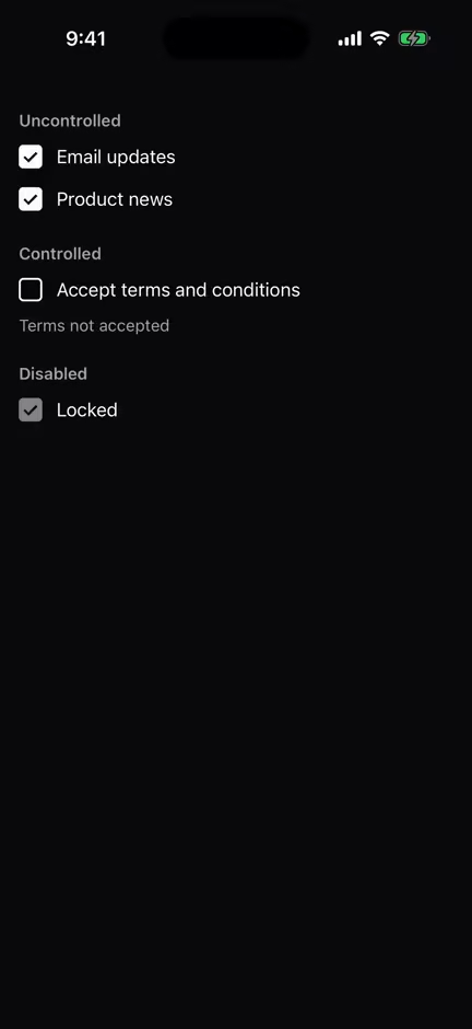
Checkbox
Forms
Controlled or uncontrolled checkbox with a check mark drawn from plain Views.
IN PROGRESSRepo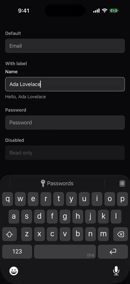
Input
Forms
Themed TextInput that forwards every prop and highlights its border on focus.
IN PROGRESSRepo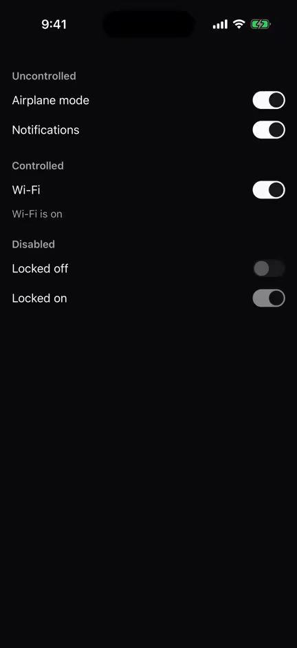
Switch
Forms
On/off toggle whose track color and thumb slide animate on the UI thread with Reanimated.
IN PROGRESSRepo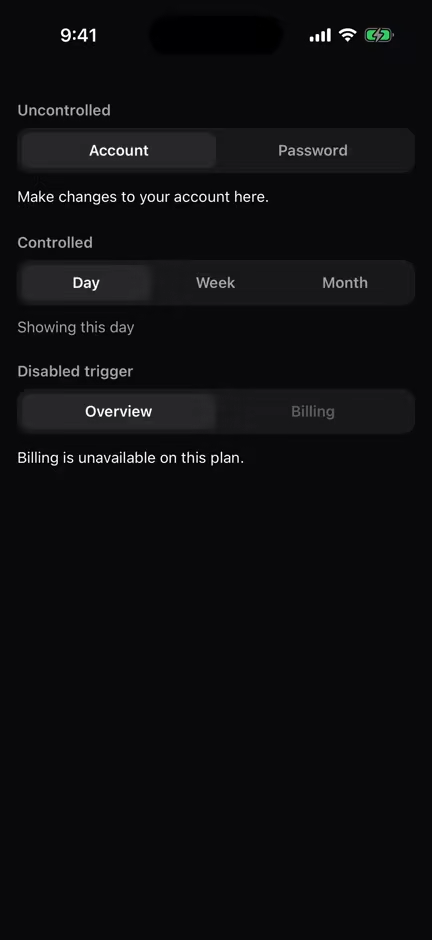
Tabs
Tabs
Segmented-control tabs that show one panel at a time, controlled or uncontrolled.
IN PROGRESSRepo